March - June 2024
Tangata - an HR Management Software
Role
Product Design
UX Research
Platform
SaaS
Industry
B2B
Introduction
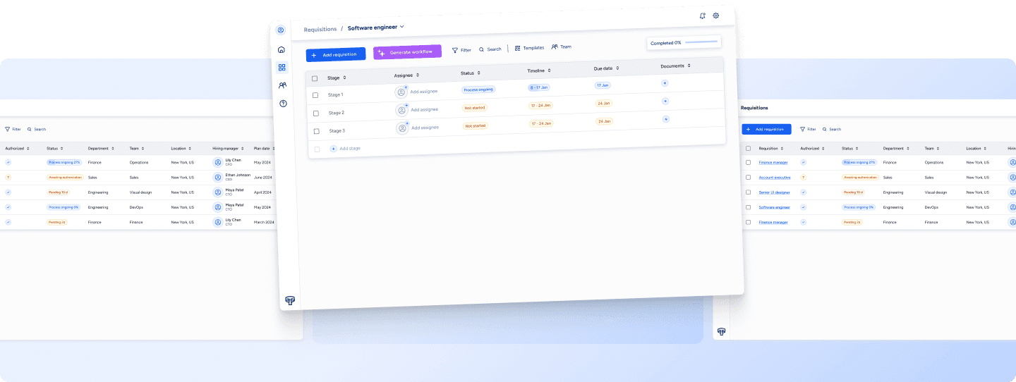
Tangata is a centralized HR management system designed for medium-to-large software companies. The system aims to streamline HR processes, including recruitment, training, welfare, and more. This case study is based on a UX exercise written by Vitaly Mijiritsky.
You can find the detailed requirements in this article.
Problem
HR management's complexity requires efficient coordination and tracking. The challenge was to design a system that streamlines processes, integrates with existing structures, facilitates communication, and customizes workflows.
Goals
→ Design a solution for the creation and management of recruitment processes.
→ Show the current stage and integrate progress tracking tools.
Stakeholders Interviews
I interviewed 2 stakeholders to learn the following:
How recruitment is currently done
The challenges they face during recruitment
What the system needs to accomplish for the company
Their main pain points and issues
Ideas on how to make the recruitment process better
VP of HR
Responsible for recruitment, termination, training, and development.
HR Recruiter
Responsible for recruitment and candidate evaluations.
The Core Pain Point
“Hiring a person who is not suitable
for the role is expensive„
-VP of HR
Key Findings
Defining job descriptions
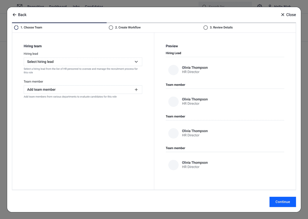
Defining the team and team leader
Defining schedules and KSF goals
Ability to learn process duration
Writing managers' feedback
Flexible recruitment process module
Research
During the research phase, I checked out similar products like Greenhouse, Workable, and Comm-IT and found they all have tools for creating, editing, and duplicating workflows. I also looked at Asana and Monday to see how their layouts and structures work. This helped me come up with a basic layout for Tangata.
Brainstorming Ideas
I tested a few ideas, some common and some more unique.
Hiring Workflow Dashboard Ideas
Creating New Workflow Ideas
User Testing
To find the best solution for each feature, I created a prototype and conducted user testing using Maze's Prototype Testing tool. Here is the full report.
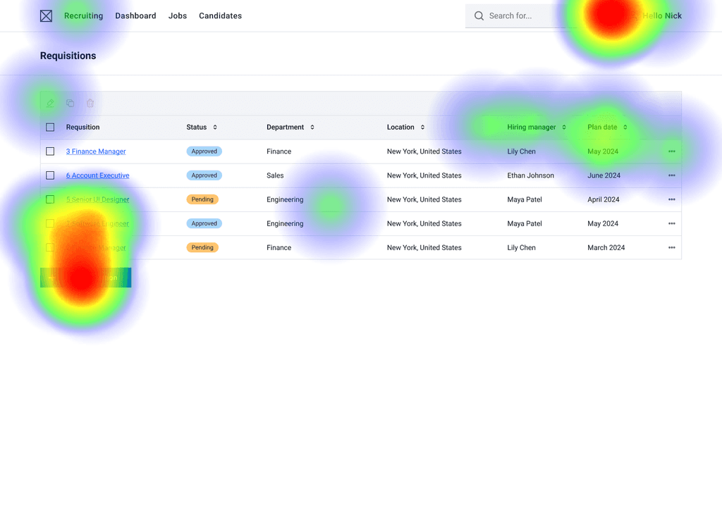
Requisitions Screen
75% Misclicked
The heatmap shows a lot of testers exploring around, which might mean they felt a bit overwhelmed jumping straight into this dashboard screen.
25% Lost Path
1 tester got completely lost and abandoned the test.
New Hiring Workflow
67% Misclicked
The heatmap shows the testers clicked on various buttons, possibly to check responsiveness or because they were confused by the screen layout.
20.6s Average Time
The average time spent by testers on this screen is long. This can translate to lost testers and a high bounce rate.
Adding Team Members
100% Misclicked
This data is very unusual, but it still indicates a problem in the process. It may have been caused by bugs in the prototype.
11.7s Average Time
The average time spent by testers on this screen is good, but there’s always room for improvement.
Adding New Stages
67% Misclicked
Same as before, it shows the testers clicked on various buttons, probably they were confused by the screen layout.
22.8s Average Time
The average time spent by testers on this screen is long. This can translate to lost testers and a high bounce rate.
Filling Stage Information
33% Misclicked
The decrease in the misclick rate is likely due to users becoming familiar with the screen after performing several actions.
7.2s Average Time
The average time spent by testers on this screen is just perfect.
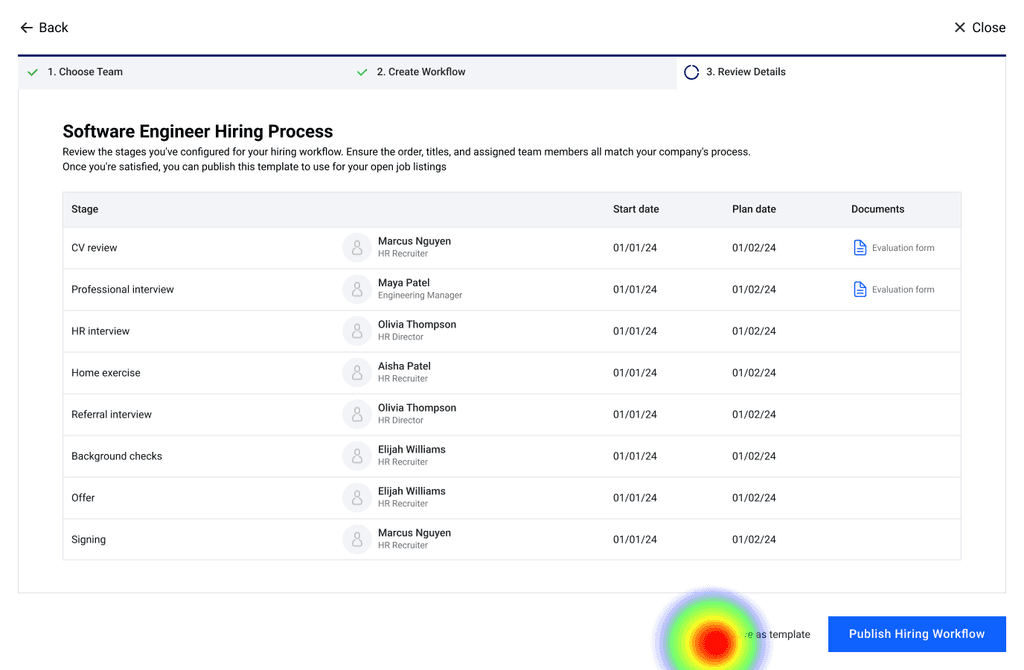
Saving Workflow Template
33% Misclicked
The data does not indicate the same conclusion as the heatmap. We can infer that the process is clear enough.
12.8s Average Time
The average time spent by testers on this screen is good, but there’s always room for improvement.
Report Summary and Conclusions
Complicated workflow
Creating a new hiring workflow and team was too complex and had too many screens.
Quick User Familiarization
After completing a few tasks, users became familiar and navigated easily.
Time-Consuming Stage Setup
Filling in the stages and creating them took too long.
Successful Template Save
Saving the hiring workflow as a template worked well.
Final Product Overview
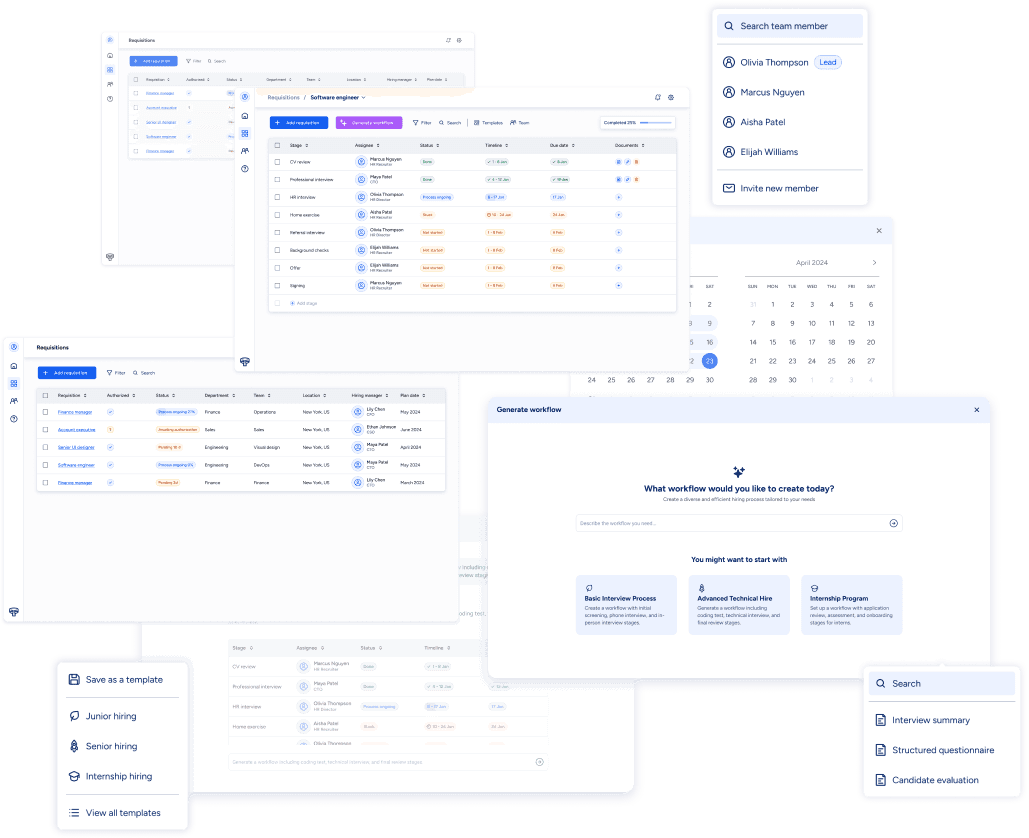
The design process involved implementing the fixes identified from the previous learnings and building the design system for the product. Each feature was thoroughly prototyped using Figma's variables to capture the user experience accurately.
AI-Generated Workflow
Utilizing AI to streamline the workflow creation process, aiming to maximize simplicity, so users aren't required to perform long and complex tasks.
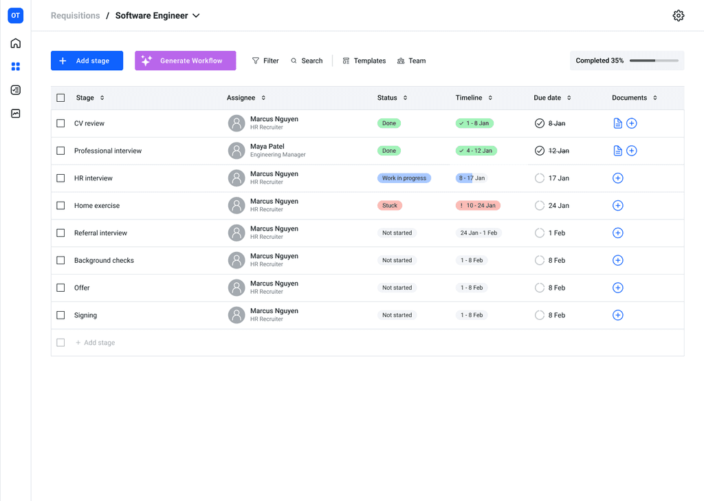
Editing Workflow
Flexible and intuitive workflow customization, direct editing in the table, and see progress updates in real-time.
Action Bar
Quick access to essential tools, editing, duplicating and erasing tasks.
Saving Templates
Streamlining repeated tasks with custom templates.
Filtering
Filtering enhances usability by focusing on relevant data, ensuring clarity.
Project Reflection
This project was a learning journey for me, especially as I started without any knowledge of HR. If I were to continue developing this product, I would conduct more user testing with a larger group of participants to gather more data. Additionally, I would add a dashboard for managers to monitor performance and draw better conclusions.
I want to express my gratitude to Rani Rotem, my mentor, who provided valuable feedback throughout this case study. I also want to thank Vitaly Mijiritsky for writing the requirements document that served as a roadmap for this project.
