2022 - Ongoing
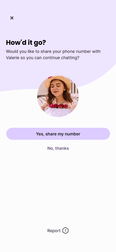
Vidit - Dating App
Role
Lead Product Design
UX Research
Design QA
Team
Lead Designer (Me)
UX Researcher
CTO & Engineering team
Industry
B2C


The Brief
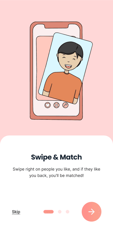
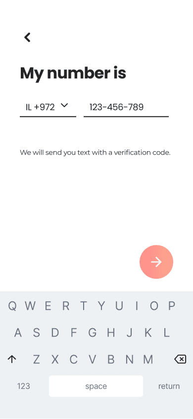
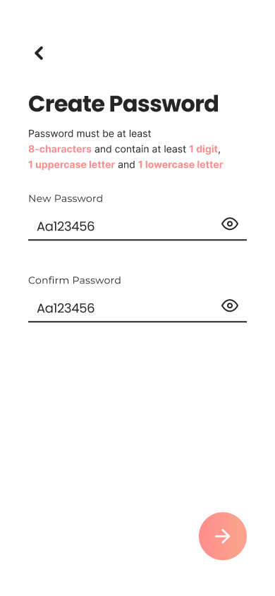
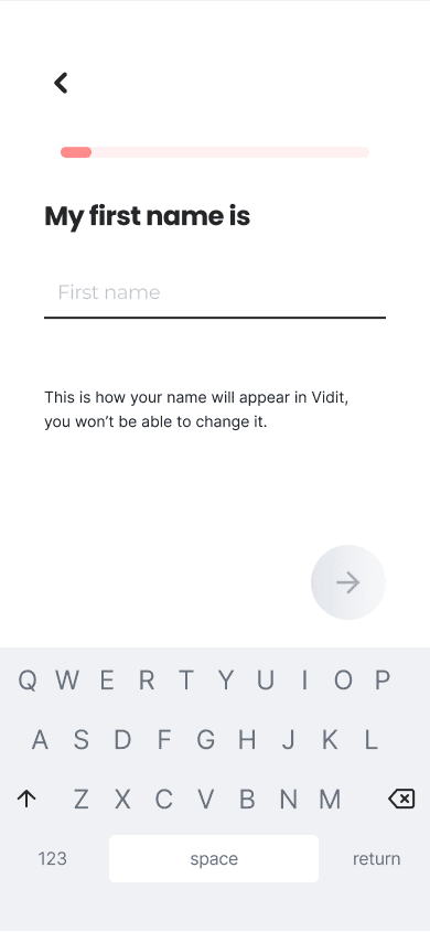
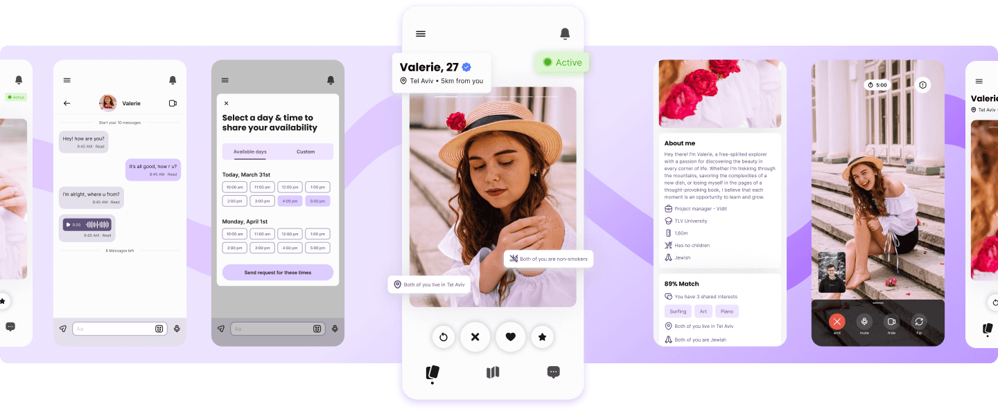
Vidit is a dating app designed for individuals who are serious about finding a romantic partner and are frustrated with the superficiality of existing dating platforms. Unlike conventional dating apps that often lead to ghosting and wasted dates, Vidit emphasizes authentic connections through voice and video calls before meeting in person.
My Role: As the Lead Product Designer, I was responsible for designing the entire app during its MVP stage. Additionally, I took on product management responsibilities alongside the CTO due to the lack of a dedicated product manager.


Main Problem - Ghosting
Market Gap: Traditional dating apps often suffer from issues like ghosting in chats and users going on dates before assessing compatibility through voice or video conversations. This leads to wasted time and money.
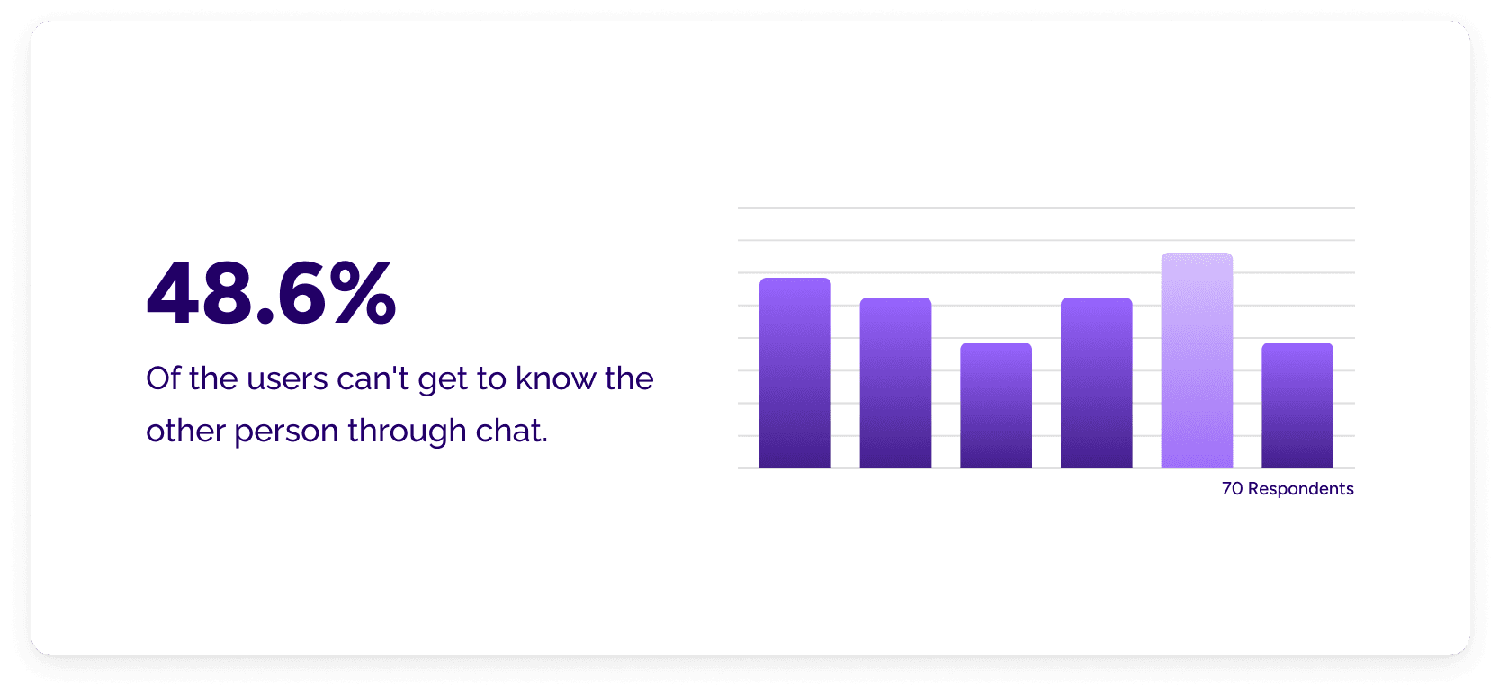
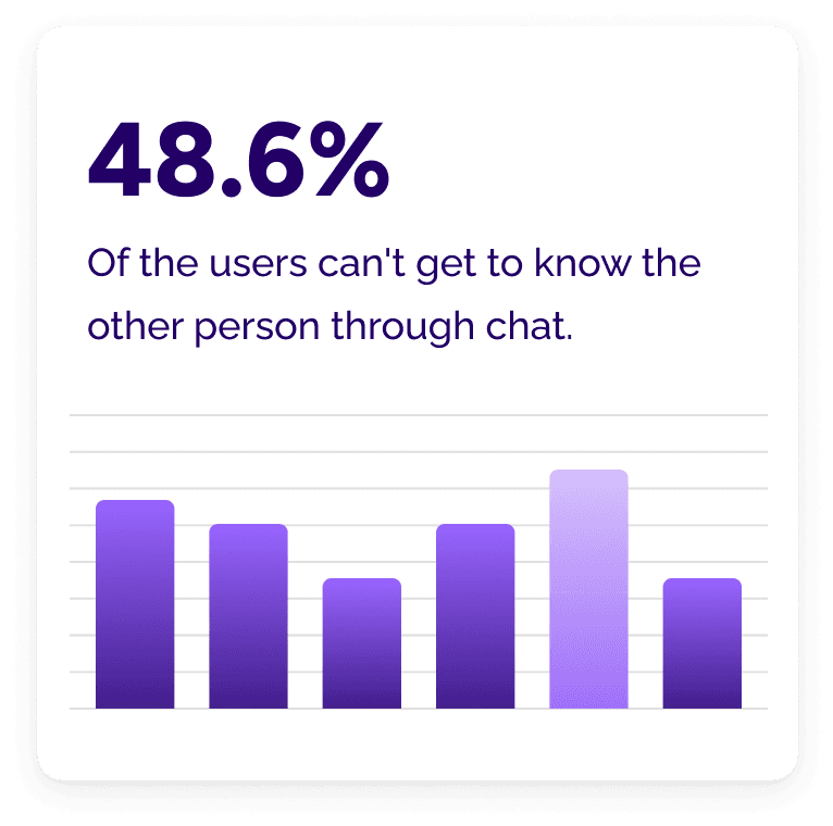
Initial Research: To address this, we conducted a survey to validate the problem and understand user needs. The survey highlighted the demand for a platform where users could have meaningful pre-date interactions to ensure compatibility before committing to in-person meetings.


Goals
Core Features
Develop a feed for swiping profiles, scheduling calls, and conducting voice/video calls
User Experience
Create a straightforward and engaging flow to facilitate meaningful connections before physical meetings.
Long-term Vision
Build a platform that prioritizes authentic connections and reduces the likelihood of ghosting and mismatched dates.
Goals
Core Features
Develop a feed for swiping profiles, scheduling calls, and conducting voice/video calls
User Experience
Create a straightforward and engaging flow to facilitate meaningful connections before physical meetings.
Long-term
Vision
Build a platform that prioritizes authentic connections and reduces the likelihood of ghosting and mismatched dates.
User rating for positive behavior
Schedule calls
Smooth voice/video calls
Smooth voice/video calls
Profile verification
Profile verification
Initial Design and Development
Design Challenges:
Limited Team: With a small design team of 2-3 designers, including myself, we faced constraints in manpower and resources. As the lead designer, I had to navigate these limitations by creating design guidelines to streamline the process.

Surveys
Design QA
Design System
Wireframing
Prototyping

UX Research
Wireframing
Design Process:
Collaboration: Regular meetings with the CTO and communication through Vidit’s Figma files facilitated effective collaboration and decision-making.
Prototyping: I designed individual screens, created prototypes, and presented them to the team for feedback. This iterative approach allowed us to refine designs based on team input.


This image is a visual illustration and does not represent an actual Zoom meeting.
This image is a visual illustration and does not represent an actual Zoom meeting.
Initial Design and Development
Design Challenges:
Limited Team: With a small design team of 2-3 designers, including myself, we faced constraints in manpower and resources. As the lead designer, I had to navigate these limitations by creating design guidelines to streamline the process.

Surveys
Design QA

Design System
Wireframing
Prototyping

UX Research
Wireframing
Design Process:
Collaboration: Regular meetings with the CTO and communication through Vidit’s Figma files facilitated effective collaboration and decision-making.
Prototyping: I designed individual screens, created prototypes, and presented them to the team for feedback. This iterative approach allowed us to refine designs based on team input.

This image is a visual illustration and does not represent an actual Zoom meeting.
Vidit Design 1.0
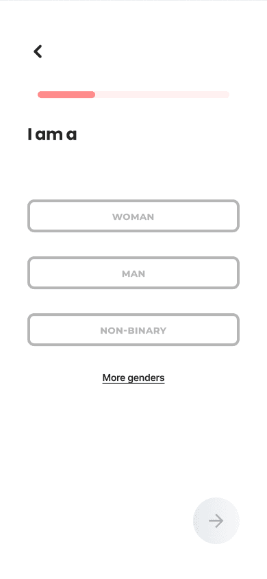
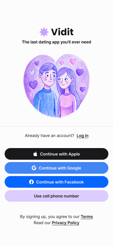
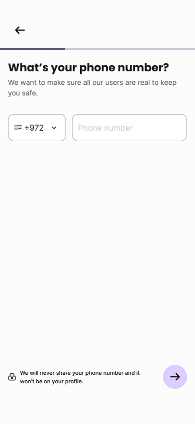
In the next section, Vidit's initial design version is represented. This includes the original layout and features that formed the foundation of our product.
Vidit Design 1.0
In the next section, Vidit's initial design version is represented. This includes the original layout and features that formed the foundation of our product.
Onboarding & Sign In
Creating Profile
Swiping, Scheduling & Date Calls
User Testing and Feedback
Feedback revealed that while the video call feature worked well, the general design needed improvements. Users found the design unengaging and lacking in trust-building elements.
Smooth voice/video calls
Design needs improvment
User Testing and Feedback
Feedback revealed that while the video call feature worked well, the general design needed improvements. Users found the design unengaging and lacking in trust-building elements.
Smooth voice/video calls
Design needs improvment
Iteration and Redesign
Incorporating Feedback: Based on user feedback, I developed a comprehensive design system and a fresh look for the app to enhance user engagement and trust.


Atomic Design: We adopted atomic design principles, creating flexible components to improve design consistency and efficiency.
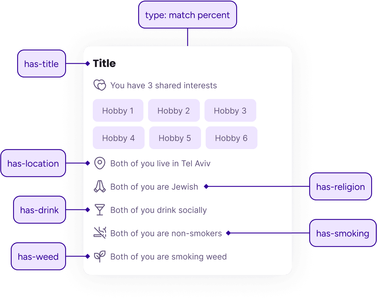

User Research: Additional surveys and interviews revealed that users preferred to exchange a few messages before engaging in voice/video calls.
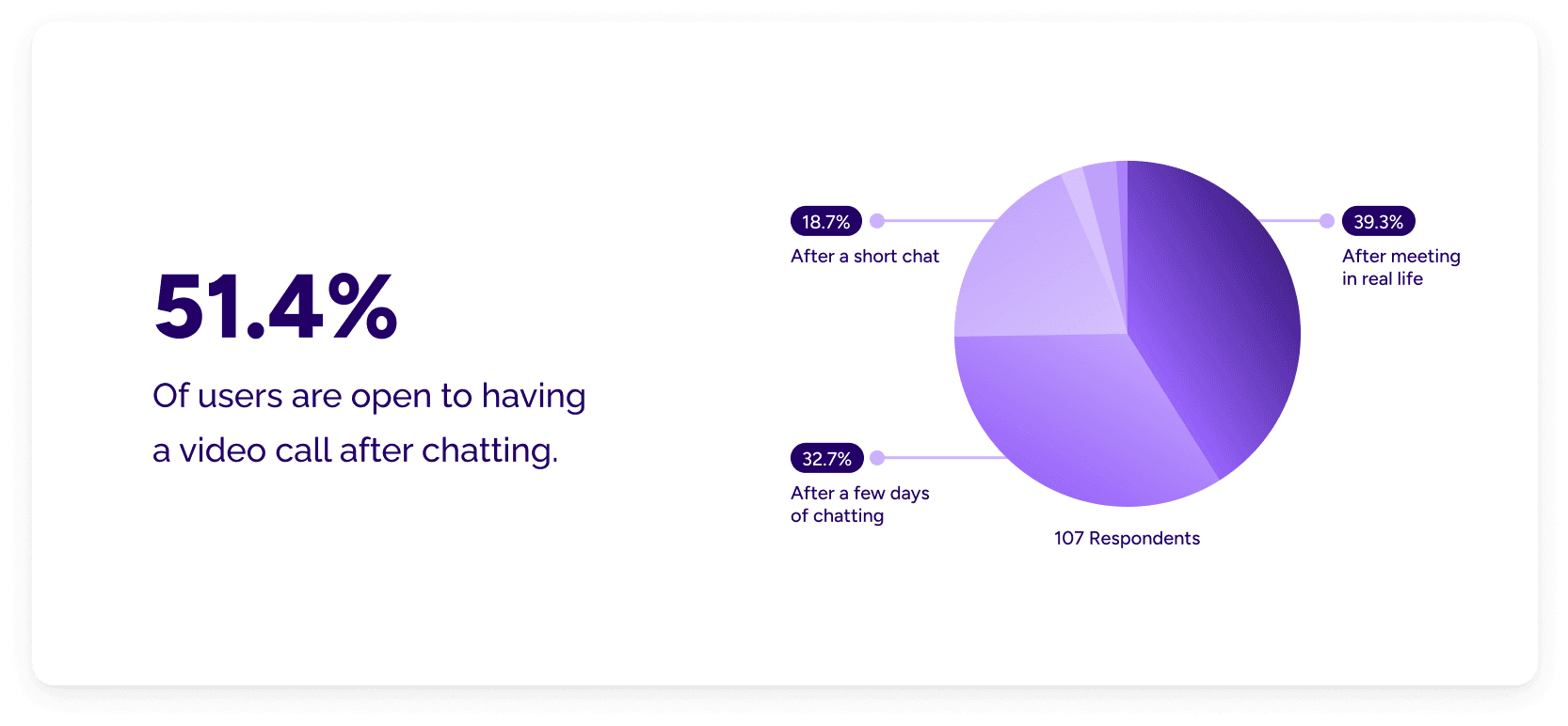


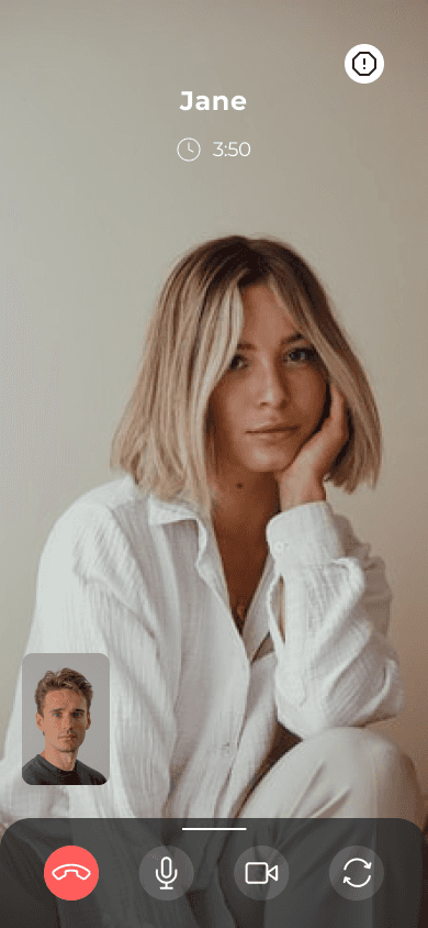
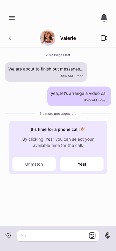
Chat Limit: To address this, we introduced a feature allowing users to exchange up to 10 messages before their first voice or video call. While some users prefer chatting for a few days and others just a short chat, we limited the chat to prevent ghosting and maintain the focus on genuine, face-to-face conversations.
Current Status: The feature is in the planning stage, with a wider-scale test planned to assess its effectiveness and user reception.
Iteration and Redesign
Incorporating Feedback: Based on user feedback, I developed a comprehensive design system and a fresh look for the app to enhance user engagement and trust.

Atomic Design: We adopted atomic design principles, creating flexible components to improve design consistency and efficiency.

User Research: Additional surveys and interviews revealed that users preferred to exchange a few messages before engaging in voice/video calls.


Chat Limit: To address this, we introduced a feature allowing users to exchange up to 10 messages before their first voice or video call. While some users prefer chatting for a few days and others just a short chat, we limited the chat to prevent ghosting and maintain the focus on genuine, face-to-face conversations.
Current Status: The feature is in the planning stage, with a wider-scale test planned to assess its effectiveness and user reception.
Vidit Design 2.0
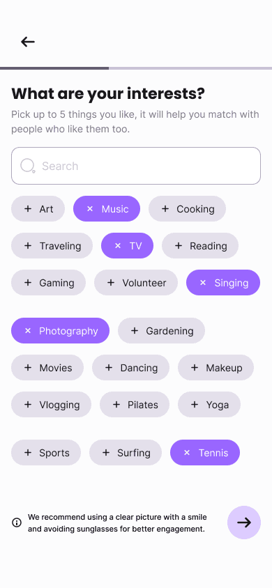
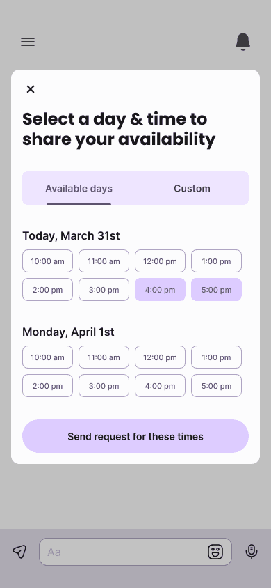
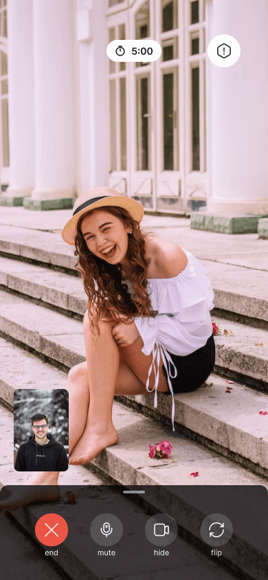
The new design incorporates all the feedback fixes and includes the new chat feature.
Vidit Design 2.0
The new design incorporates all the feedback fixes and includes the new chat feature.
Creating profile
Swiping & Chatting
Video call
Conclusion
Vidit aims to transform the dating experience by reducing ghosting and ensuring compatibility through meaningful pre-date interactions. The redesign and new features are steps towards making the app more engaging and user-friendly.
Next Steps: Continued development and testing will refine the user experience and validate the effectiveness of the new features. My role in guiding the design and product strategy will be crucial in achieving Vidit’s long-term goals.
Reflection and Learnings
Dynamic Environment: The project’s evolving nature taught me to adapt quickly and continuously seek ways to enhance the user experience.
Team Leadership: Leading the design team through challenges and limitations helped me develop strategies to maximize our output and keep team motivation high.
Personal Growth: Maintaining team morale and fostering a collaborative environment where everyone felt empowered to contribute ideas was a significant achievement.
